UI that
refuses to blend in.
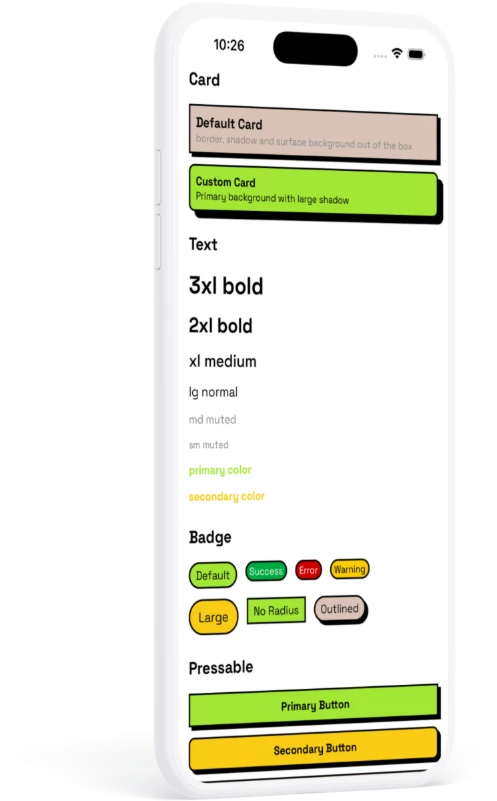
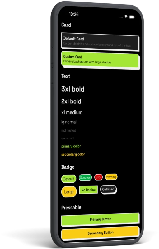
RN Neo is a component library for React Native — raw borders, hard zero-blur shadows, flat loud color. Token-driven, fully typed, Expo-ready.
Don't take our word for it.
Edit the code and watch it run — live, in your browser. No install.
Not just components. A system.
Everything snaps to one design language, so your screens stay consistent without effort.
Token-driven
Colors, spacing, radius, shadows and type live in one theme. Change a token, the whole app follows.
Composable
Small primitives you extend, not rigid widgets you fight. Build your own on top.
Theming that scales
Light, dark, and custom themes with runtime switching — consistent across every component.
Typed APIs
TypeScript-first props with sane defaults. Autocomplete every variant, catch mistakes early.
Expo-ready
Works out of the box with Expo and bare React Native. No native config gymnastics.
Built for real apps
Handles complex layouts and large codebases — reusable patterns, stable structure.
Up and running in three steps
Install, wrap, ship. That's the whole setup.
$ npm install rn-neo react-native-reanimated// App.tsx
import { ThemeProvider } from 'rn-neo';
export default function App() {
return (
<ThemeProvider>
{/* your app */}
</ThemeProvider>
);
}import { Button } from 'rn-neo';
<Button variant="primary">Press me</Button>Build something loud.
Drop RN Neo into your next React Native app and ship a UI with attitude.